Modern Web Design
Today came across this awesome n funny pie chart while browsing.
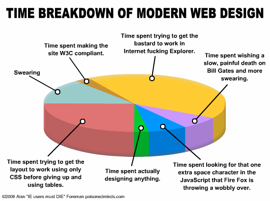
Every site owner, who's actually worked on his / her site's design will totally identify with this chart. Specially, the pink and yellow pie-parts are something that really bothers, and that's why they are consuming that much part of the chart.
Lemme know about your take on this. Leave it as a comment here.
I found this chart at ZLythern.
posted by kjnb @ July 17, 2007
0 Comments
![]()

0 Comments:
Post a Comment
Subscribe to Post Comments [Atom]
<< Home