Tips to optimize your blog and get maximum visits
If you are new to the blogsphere, or been blogging for a while but don't get that many visitors, it's time that you have look at the layout of different specs on your item page. Most of the visits that a site gets is through search engine results or link form other sites or RSS feeds. On all these cases, visitors land on item page of some specific post of your blog. They may just read the post and leave. But if you wanna get them back as loyal readers, you've gotta spice up your page to make a good first impression. But be cautious. Overdo it, and you may just irritate your visitor away.
Here I give you few essentials tips to make your page optimally user-friendly. Follow them closely, implement them and see the popularity of your site soaring high.
Here I give you few essentials tips to make your page optimally user-friendly. Follow them closely, implement them and see the popularity of your site soaring high.
- Title : Give your post a proper title. When a visitor has come to your site following a link to your post, he's already formed an idea about the post, as per the title. So, if it's not catchy enough, he just might not be interested in reading it at all. And if it doesn't justify or match with the content of the post, the visitors feels lost, or worse - mislead and cheated. So, be careful while choosing a title.
- Time Stamp : The best place to show the time stamp, i.e., when the post was written, is just after the post title. Don't make the visitor shuttle between top and bottom of the post just to check when it was posted. A visitors needs to know the currency of the post before reading it, not after finishing it. Check one such ideal use in pic below.

- Font Size and Line Spacing : Use moderate font sizes. Don't make the reader squint their eyes to read your content. 1em is considered the perfect size for a comfortable reading. Add or subtract .1 or .2 em as per your linking, but don't make it too tiny or too large. Best option is, you can use a variable font-size widget. Check this.
Just like font size, line spacing is also an important property. It's set by the CSS property line-height. As the name itself makes it clear, without line spacing, all the text lines look crammed. Useline-height: 1.5em
or some other value that suits you.
Check the two images below for comparison. First image is example of how the text looks when there's no line spacing. 2nd image is of the same post, but with 1.5 em line-height. Text n background is green in both pics as the text is selected to highlight the space between two lines.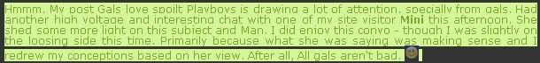
Text without line spacing [line-height: 0]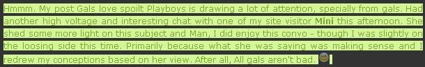
Text with line spacing [line-height: 1.5em]  Image margin : Probably the most visually appealing property that can ruin the mood of your visitors if not used properly. There should be some empty space all around the images of your post. Give your images some breathing space. Check image on right. Have at least 5 px space between your images and text. This property can be set using
 .img {
code in the post-image class in your stylesheet or you can use it as follows -
margin: 5px
}<img src="image.jpg" style="margin: 5px" >
for individual images.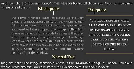 Use Blockquote & Pullquote : Whenever you are quoting someone or some other source, use blockquote. To instantly draw the attention of the visitor to a particular important part of the post, use Pullquote. Their implementations are explained in code section below.
- Easy Comment Option : Commenting on the article should be easy. The more comments your post has got, the more popular and attractive it seems to the visitors. Wordpress style commenting is the best. But blogspot bloggers doesn't have this feature. You can use this hack. Otherwise, the link for comment form should be placed in such a location that it could be found easily. Preferably, just at the end of the post.
- Top Commentators : Another way to get your readers involved is to use a 'Top Commentators' widget on the sidebar. Everyone wants to be on 'Top 10', don't they. So, if you have such a widget, which will list 10 people as top readers / commentators, it'd seem like reward for the visitors. They will comment on your posts with more enthusiasm. Check this post for ways to install 'Top Commentator' widget. And if you're not a wordpress user, go for the recent comments widget as explained here.
- Bookmark Options : This is one important way to get more visitors. Provide social bookmark links at the end of your post. [Check end of this post, for example] This will help other visitors to find your post and eventually visit it, leading to more traffic to your site. One very useful way of providing social bookmarking options is explained here. Alternatively, you can make use of Add This. It provides options for bookmarking your story to all major social bookmarking sites. Follow instructions there.
- Related Post : At the end of post - use a widget like Related Post. The visitor has come to your site to read about some particular topic. And if you provid ehim with alternate links of related post, he'll surely visit some of them, in turn staying on your site for more time.
- Top Articles : Sidebar is the best location to place a widget like "Top Viewed Posts" of your blog. This will prompt the visitor to visit your other posts, instead of leaving your site. You can manually build one such list of posts and place it on the sidebar. Or, there are some vendors who provide such widgets. Check Spotplex. Trust me, this is really a very useful widget.
- Provide feeds easily : All these done and now the visitor is impressed with your blog. But if it takes him long to figure out how to subscribe to it or where to get the feed, he'll simply close the window. Place the site feed subscription options either at the top or bottom of the sidebar. I strongly oppose placing it in between. And, provide both Bookmarking and email subscription options. Use Feedburner as it provides a host useful services along with your feed. And use the standard RSS Feed icon instead of a text link as it will help visitors to easily locate it and understand its purpose.
Code Section :
Code for Above tricksGiven below is the ideal pieces of code to implement above tips. Change the integer values as per your liking and check the effects. You need to place these codes appropriately in your stylesheet or between opening <style> and closing </style> tag of your site template.
body {
 font: 1em 'Lucide Grande', Verdana, Arial, Sans-Serif;
 line-height: 1.5em;
}

.img {
 margin: 5px;
 padding: 3px;
}

.blockquote {
 background: url('blockquote.gif') no-repeat top left;
 margin-left: 3.9em;
 color: #8f8f8f;
 width: 80%;
}

.pullquote {
 padding: 10px;
 width: 200px;
 float:right;
 margin:10px 0 10px 10px;
 border-top:2px solid #694e1c;
 border-bottom:2px solid #694e1c;
 text-align: center;
 line-height: 22px;
 font-family: georgia, verdana, Arial, Helvetica, sans-serif;
 font-variant: small-caps;
 color:#ccc;}  /* Usage - h4 class="pullquote"   */
Ok, so these are the few minimum basics that you should follow to optimize your post page. Once the visitor is impressed, he'll surely visit it again and refer it to his / her pals. That way, the readership of your site will keep increasing. Lemme know if you need help regarding any of the tips above. I'll be glad to assist you in any way. Keep blogging. Chao.
posted by kjnb @ September 12, 2007
0 Comments
![]()

0 Comments:
Post a Comment
Subscribe to Post Comments [Atom]
<< Home